QR code feedback became the default way an in-person business asks customers what they thought somewhere between the 2020 menu shift and now. The square is on the receipt, the table tent, the back of the door at the gym. Customers scan, the form opens on their phone, they tap a few stars and type a sentence, done.
That's the version that works. Plenty of businesses also have the version that doesn't: a sticker taped to the till, leading to a Google Form that hasn't been opened by the owner in four months. The difference between the two is a handful of decisions about placement, form design, prompt copy, and what happens to the responses afterwards.
This guide is the long version of those decisions.
On this page
- Why QR codes work for in-person feedback
- Placement (the make-or-break decision)
- What a high-converting QR feedback form looks like
- Getting people to actually scan
- Length and mobile optimisation
- Branded vs generic QR codes
- Integrating QR with other channels
- Tools that do QR feedback well
- Frequently asked questions
Why QR codes work for in-person feedback
A QR code is a fancy-looking shortcut that saves the customer from typing a URL. That's the whole technical contribution. The reason it matters is everything around it.
For an in-person business, the customer is in the building. Their phone is in their hand or pocket. They've had the experience and have a fresh impression of it. The friction that kills feedback in other channels (forgetting, losing the link, getting distracted before they finish) is at its lowest right there in the room.
The pandemic did the heavy lifting on adoption. Restaurants moved menus to QR codes for hygiene reasons, and customers learned the gesture: open camera, point at square, tap the banner. By 2026 it's the path of least resistance. You don't need to teach people what to do.
That doesn't make QR codes a complete solution. They work for in-person feedback because the customer is physically present at the moment you want to ask. They're a poor fit for asking about something that happened a week ago, or for following up on a transaction that didn't happen face to face. For those, email or SMS makes more sense.
Placement (the make-or-break decision)
On the table
Customers have time and their phones out, so scan rates are typically the highest of any placement, but timing the prompt is tricky.
On the receipt
The cleanest engineered moment with no competing attention, but receipts get binned within thirty seconds if the prompt isn't immediate.
Near the exit
High recall as customers mentally close the visit, but anyone in a hurry walks straight past unless staff give a verbal nudge.
The single biggest factor in whether your QR code gets scanned is where you put it. Two businesses can use the same form, the same tool, the same prompt copy, and get scan rates that differ by an order of magnitude based on placement alone. Every option has tradeoffs.
The single biggest factor in whether your QR code gets scanned is where you put it.
On the table
Best for: cafes, restaurants, bars, anywhere customers sit for more than ten minutes.
The customer has time. They're already on their phone between courses or while waiting for the bill. A small standee or a corner of the table tent puts the code where their eyes already drift. Scan rates are typically the highest of any placement.
The catch is timing. Ask too early and the experience isn't done. Ask too late and the customer has paid and is putting their coat on. The fix most table-service places use is putting the prompt next to the bill, so the moment is built in.
On the receipt
Best for: retail, takeaway, quick-service, anything where a printed receipt is the natural close to the visit.
This is the cleanest "moment" you can engineer. The customer has just paid. They're holding the receipt. The transaction is done but the experience is still fresh. A QR code with a one-line prompt at the bottom of a receipt converts well, partly because it's the only thing on the page competing for attention.
The downside is that receipts get binned. If the customer doesn't scan in the next thirty seconds, it's gone. The prompt has to be specific enough to get the action immediately.
Near the exit
Best for: gyms, salons, dental practices, anywhere with a clear "leaving" moment.
A small sign or sticker by the door catches people on the way out, when they're mentally closing the visit. The advantage is high recall. The disadvantage is that anyone in a hurry walks straight past it.
Near-exit placement works best when paired with a verbal prompt from staff ("scan the code on the way out if you have thirty seconds"). The sign alone tends to be ignored.
In the restroom
Best for: cafes, restaurants, hotels.
This sounds odd until you try it. People in restrooms have time, privacy, and a phone within reach. A small framed QR card on the back of a stall door or above the sink gets attention because there's nothing else to look at. Hotel restrooms are particularly effective because the guest has often just had a quiet moment and is in a reflective mood.
Operators sometimes resist this placement on aesthetic grounds, but the response numbers from places that have tried it are usually enough to settle the argument internally.
The general rule for placement: put the code where the customer naturally pauses, which is rarely where you most want them to see it.
What a high-converting QR feedback form looks like
The form on the other side of the scan is where most QR workflows fail. Customer scans, form opens, form is too long or too clunky, customer abandons. Now you've burned the moment.
A form that converts on a phone has a small number of properties.
Mobile-first layout. Built for a phone screen, not a desktop survey scaled down. Buttons big enough to tap with a thumb. Text legible at the default size.
Star ratings as the first interaction. A five-star rating row is the lowest-friction first question on a phone. The customer taps once, they're committed, the rest of the questions feel like less work because they're already in motion.
One open-text question, near the end. "Anything else you'd like to tell us?" placed last, made optional, captures the qualitative gold without forcing every respondent to write something.
No login, no email field as a hard requirement. Asking for an email address as a required field will halve your response rate. Make it optional, or ask for it conditionally on a low rating if you want to follow up on complaints.
Branded, but not heavy. Logo at the top, your colours, a thank-you message that sounds like your business. Anything that looks like a generic survey tool's default styling makes the form feel spammy. The Qria forms feature (/features#forms) is built around this assumption.
A useful test: open the form on your own phone, in the actual lighting at the actual location, while doing whatever a customer would be doing. If it feels awkward, customers won't fill it out either.
Getting people to actually scan
The QR code is half the equation. The prompt next to it is the other half. A great form behind a vague prompt gets ignored.
The biggest mistake is generic copy. "Leave feedback" is a request that sounds like work. "Scan to take our survey" sounds like more work. "Help us improve" puts the burden on the customer for the business's benefit.
Specific, low-commitment prompts perform better. A few that consistently work:
- "Tell us how we did. Takes 30 seconds."
- "How was your visit? Quick form, no login."
- "Got 30 seconds? Let us know what we got right and what we didn't."
These prompts work because they put the time commitment on the page. The customer can see how much they're being asked for before they decide whether to scan, and "30 seconds" is a low enough number that most people will have it.
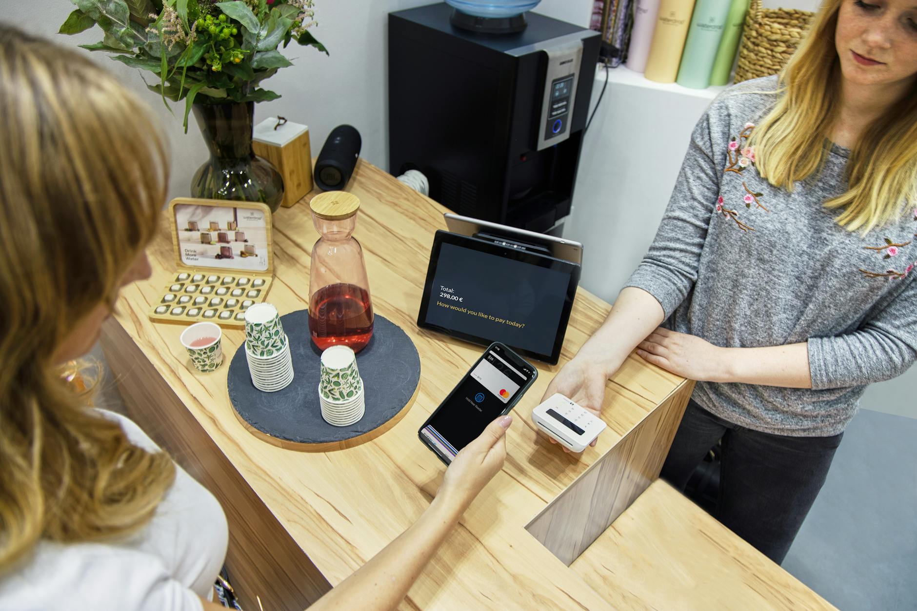
Verbal reinforcement helps a lot. If a server, host, or stylist mentions the code at the right moment ("there's a quick form on the bill if you have a sec, we read every one"), scan rates roughly double compared to signage alone. The handoff feels natural because the customer's already paying attention to the staff member.
The worst version of all this is the corporate "Your feedback is important to us" sticker on a counter where no one mentions it. The form behind it might be perfect, and nobody is going to find out either way.
Length and mobile optimisation
"Keep it short" is true and not particularly useful. Here's what specifically works on a phone.
- Under four questions for QR feedback
Three is a sweet spot. One rating, one optional multiple-choice ("what stood out?"), one optional open-text. Four is the upper limit before completion rates drop noticeably. Past four, you're accepting lower volume in exchange for richer data, which can be a valid tradeoff, but you should know you're making it.
- Tap targets at least 44 pixels
Apple's guidelines call for 44pt minimum, Google's recommend 48dp. A thumb is roughly that size in contact area. Forms that fail this test feel "fiddly" without the customer being able to articulate why.
- No autoplay video, no large images above the fold
The customer scanned on their phone, on cellular or weak café Wi-Fi. Anything that delays the form rendering is a delay during which they put the phone away. The first paint should be the first question.
- A thank-you message that sounds like a person wrote it
Not "your response has been recorded". Something like "Thanks, we read every one of these." The thank-you message is also a good place to prompt for a public review if the rating was positive (more on that below).
Branded vs generic QR codes
A generic QR code is a black-and-white square. A branded one is the same square with your logo in the middle, your colours instead of black, sometimes a frame.
Branded codes do appear to scan slightly better in practice. The mechanism, anecdotally, is that a logo-in-the-middle code looks intentional rather than spammy. Customers are conditioned to be wary of random QR codes (sticker scams are real, particularly on parking meters and public posters), so a code that visibly belongs to a known brand carries less suspicion.
There aren't reliable industry-wide stats on the size of the lift, and anyone quoting one is making it up. The directional finding from operators who've tested it is "yes, slightly better, not transformative". Still worth doing, because the cost is essentially zero once your tool supports it.
A few practical notes:
- The logo can take up roughly 20-25% of the centre of the code without breaking scanability.
- Colour matters less than contrast. A gold-on-cream code looks lovely and might not scan in low light. Test with a real phone, in real lighting, before printing fifty stickers.
- A plain black-on-white code in a custom-printed frame (with your logo above the code) is often the safer middle ground.
Qria includes custom QR branding on the Pro plan (/features#branding), which is the path of least resistance for a small business that wants the branded look without messing with third-party generators.
Integrating QR with other channels
QR is the right channel for in-person feedback. The customers who don't scan during the visit haven't told you anything yet, so building a feedback practice around QR alone leaves gaps. A workable channel mix for most small businesses:
QR for in-person. Tables, receipts, exits, restrooms. Captures the customer while the experience is fresh.
Email for transactional follow-up. Two days after a hotel stay, a week after a service appointment, a month after a major purchase. Reaches the customers who didn't scan, and gets longer, more considered responses.
Public review request as a follow-up for high ratings. When a customer leaves a 5-star response on the QR form, the thank-you screen prompts them to also leave a Google review. This turns private positive feedback into public reputation, without spamming customers who had a poor experience. Qria handles this through positive response routing, a built-in feature on the form (/features#review-routing).
SMS for service businesses with appointments. For hair salons, dental practices, mobile services, an SMS the day after the appointment ("how was your visit? quick reply") works for customers who don't read email and weren't in the building long enough to scan a code.
QR is excellent for one specific moment, when the customer is in the building and the experience is fresh. Fallback channels are how you reach the rest.
For industry-specific guidance, the cluster posts on cafes and restaurants, hotel guests, hair salon clients, and spa clients each go into the channel mix that fits the workflow.
Tools that do QR feedback well
A small number of tools handle QR feedback as a first-class workflow. Most form builders treat QR as an export option, where you generate a code from the form's URL using a separate generator. That works, but the experience around it varies a lot. A light comparison of four common options:
| Tool | QR generation built-in | Branded QR | Mobile-optimised form | Free tier | AI analysis |
|---|---|---|---|---|---|
| Qria | Yes | Yes (Pro) | Yes | No (14-day trial) | Yes |
| Typeform | Yes (paid plans) | Limited | Yes | Limited | No |
| Google Forms | No (use external generator) | No | Functional | Yes | No |
| SurveyMonkey | Some plans | Limited | Yes | Limited | No |
A few things to read out of that.
Built-in QR generation matters more than it sounds. Tools that don't include a generator force you to use a third-party site every time the form URL changes. Most free generators are reasonable, so this isn't a dealbreaker, but it adds an ongoing step.
Branded QR is a Pro-tier feature on most platforms that support it at all. If logo-in-the-middle codes matter to you, expect to pay for them.
AI analysis is the differentiator. Most form tools collect data and stop there. The work of reading hundreds of open-text responses and figuring out what customers are actually saying is left to the operator. That's the gap Qria is built to fill: a structured AI feedback platform with branded QR forms designed for in-person businesses, with a weekly summary of themes you can read in two minutes instead of two hours.
For a deeper dive on individual tools, the tools-compared post goes head-to-head on the same shortlist.
Frequently asked questions
How do I create a QR code for customer feedback?
Most feedback platforms generate a QR code automatically from the form's URL. If your tool doesn't, copy the form URL into a free generator like QR Code Monkey, download the image, and print it on whatever you're displaying. Test the printed code with a real phone before producing a batch.
Should I require an email address on a QR feedback form?
No. Required email cuts response rates roughly in half on mobile forms, and the customers most likely to refuse are the ones with the most considered feedback. Make it optional. If you need an email for follow-up on negative feedback, ask for it conditionally based on the rating.
Are branded QR codes worth the extra work?
Probably yes, if your tool generates them natively. The lift on scan rate isn't transformative but it's directionally positive, and the cost is essentially zero. The branding also signals legitimacy, which matters now that QR-based scams have made customers more cautious.
Can a QR feedback form replace email surveys entirely?
For some businesses yes, for others no. A cafe or salon where the customer is in the building for the whole transaction can plausibly run on QR alone. A hotel, a tour operator, or a B&B with a longer engagement and a clear post-visit moment will get more out of QR plus a follow-up email a day or two later. The two channels capture different kinds of feedback and work well together.
How long should a QR feedback form be?
Three or four questions is the sweet spot. One required rating, one or two optional follow-ups, one optional open text. Past four questions, completion rates drop.


